TextField 最常用的文本输入widget。
- 该 widget 作为文本输入框,可以接收用户以屏幕按键或者键盘输入的文本信息。
- 用户修改文本信息时,可以通过Onchange回调函数,获取到最新的文本信息。
- 用户输入完毕后,TextField会调用onSubmitted回调函数。
- 可以通过decoration参数控制widget的样式。
效果图:
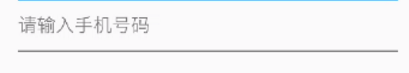
1. 基本用法
例子1:
默认情况下,TextField 下方有一个下划线进行修饰。
TextField()例子2:
TextField(
    keyboardType: TextInputType.number, // 设置文本框,键盘类型,这里设置为数字键盘
    decoration: InputDecoration( // 通过InputDecoration类设置input widget样式
                    contentPadding: EdgeInsets.all(10.0),  // 设置内间距为10个像素
                    icon: Icon(Icons.text_fields), // 设置左侧图标
                    labelText: '1381111111)', // 输入框内容
                    helperText: '请输入手机号', // 帮助文本内容
                ),
    onChanged: (str) {  // 用户修改内容,会调用回调函数
                    print(str); // 打印用户输入的内容
                },
    autofocus: false, // 是否自动获取输入焦点。
)
2. 参数说明
| 参数 | 参数类型 | 说明 | 是否可选 |
|---|---|---|---|
| keyboardType | TextInputType | 键盘类型,支持常用的文本、数字键盘 | 是 |
| decoration | InputDecoration | 文本框装饰器,可以用来设置widget的样式 | 是 |
| autofocus | bool | 是否自动获取输入焦点 | 是 |
| onChanged | void Function(String value) | 内容变化的回调函数 | 是 |
| onSubmitted | void Function(String value) | 输入完成后的回调函数 | 是 |
3. TextInputType类型说明
TextInputType常用类型如下:
- TextInputType.text - 默认键盘
- TextInputType.multiline - 多行输入
- TextInputType.number - 数字键盘
- TextInputType.phone - 数字键盘的一种,用于电话号码输入
4. InputDecoration类型说明
输入文本框装饰类,常用参数如下:
| 参数 | 参数类型 | 说明 | 是否可选 |
|---|---|---|---|
| labelText | String | 用于描述输入框 | 是 |
| labelStyle | TextStyle | 控制labelText的样式,接收一个TextStyle类型的值 | 是 |
| helperText | String | 辅助文本,位于输入框下方 | 是 |
| helperText | String | 辅助文本,位于输入框下方 | 是 |
| hintText | String | 提示文本,位于输入框内部 | 是 |
| errorText | String | 错误信息提示 | 是 |
| contentPadding | EdgeInsetsGeometry | 内间距 | 是 |
| enabled | bool | 输入框是否可用 | 是 |